STACK Brand Evolution
PROBLEMSTACK’s visual identity has had to keep pace with an ever-evolving platform and market strategy. Every change demanded a brand update without losing what customers already recognized and trusted.
StrategyLead STACK through three major brand updates, timing each transition to the equity each product carried. I ran point on top-level brand decisions while delegating production to designers, learning specialists, help center and product marketing teams.
ExecutionI helped guide in-house designers, contract partners and cross-functional teams from early concepts to working brand systems, then through the “Powered by STACK” transition and into one end-to-end platform across marketing, sales, help centers and the app.
ResultsFour brands became one connected, recognizable STACK platform. The brand systems built along the way, including visual standards, templates, asset libraries and creative request processes, are still in use today.
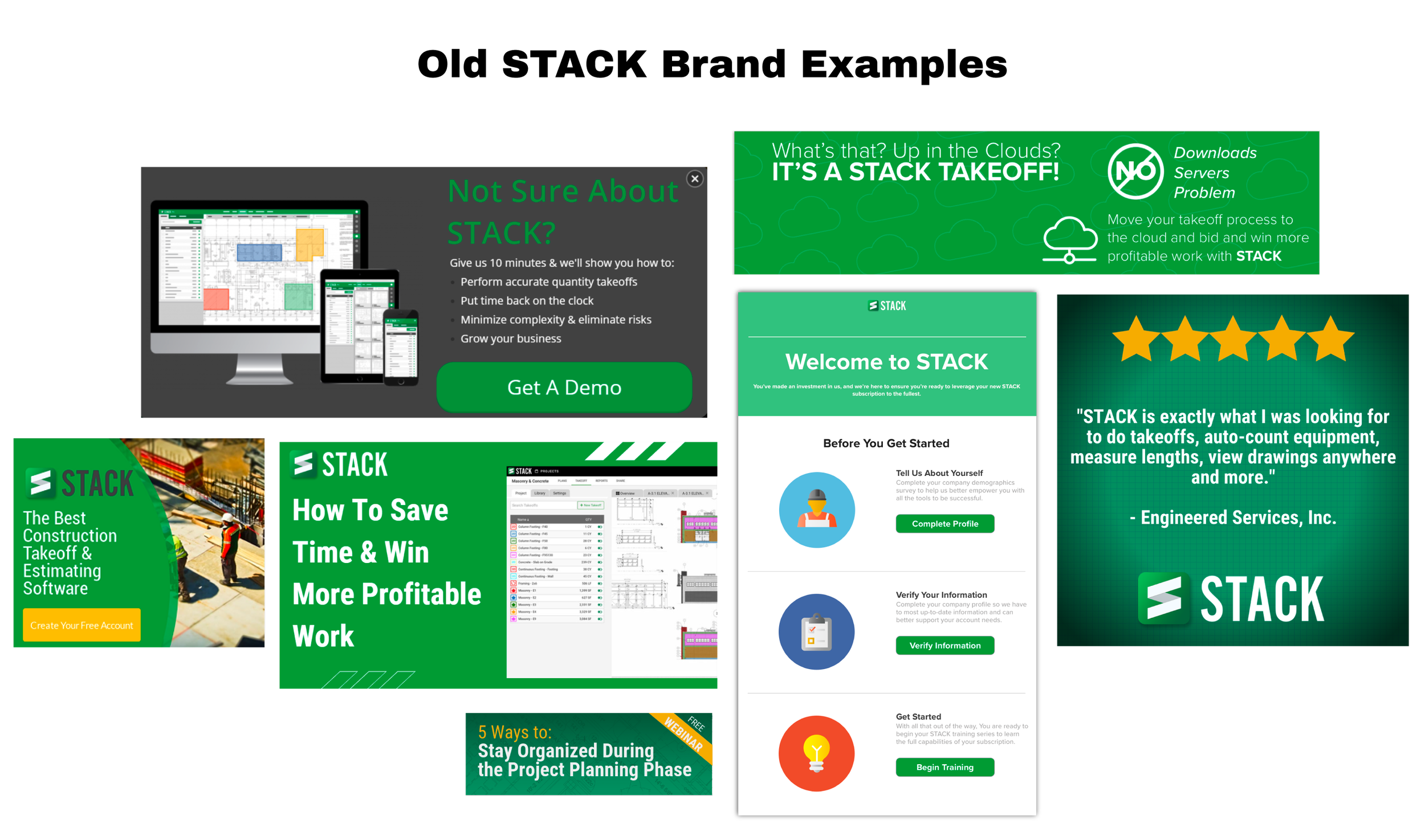
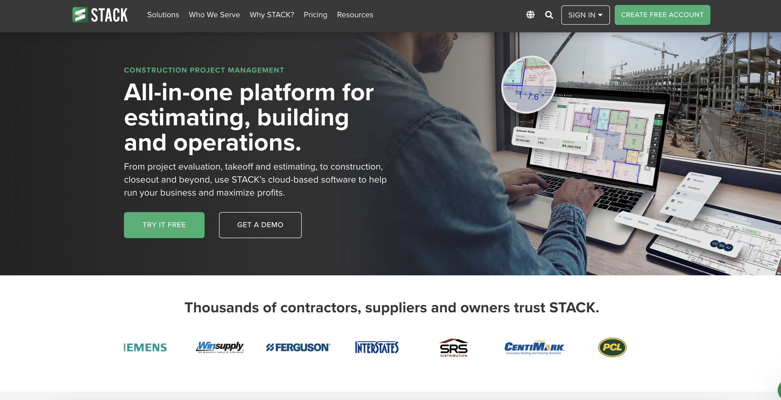
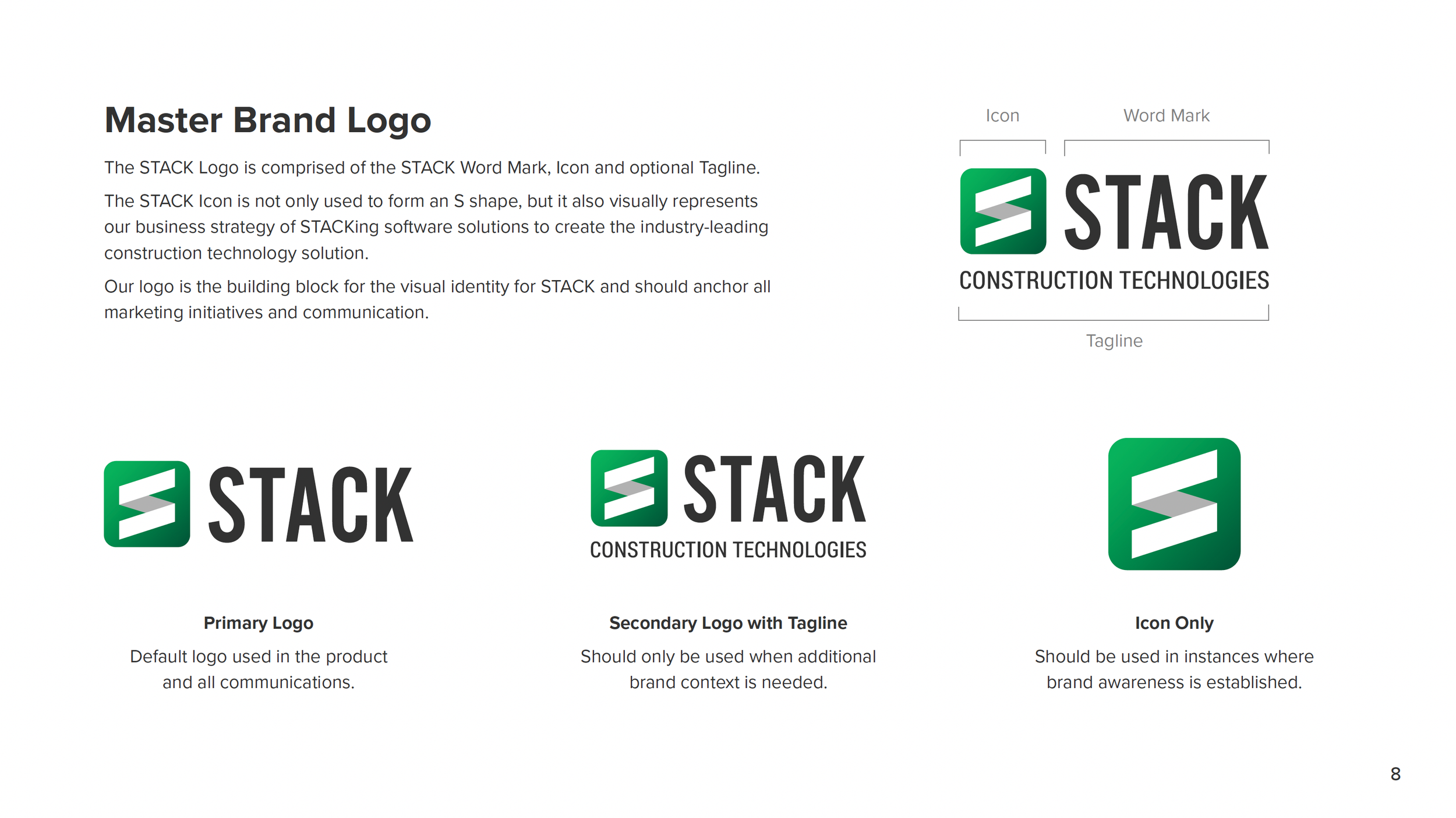
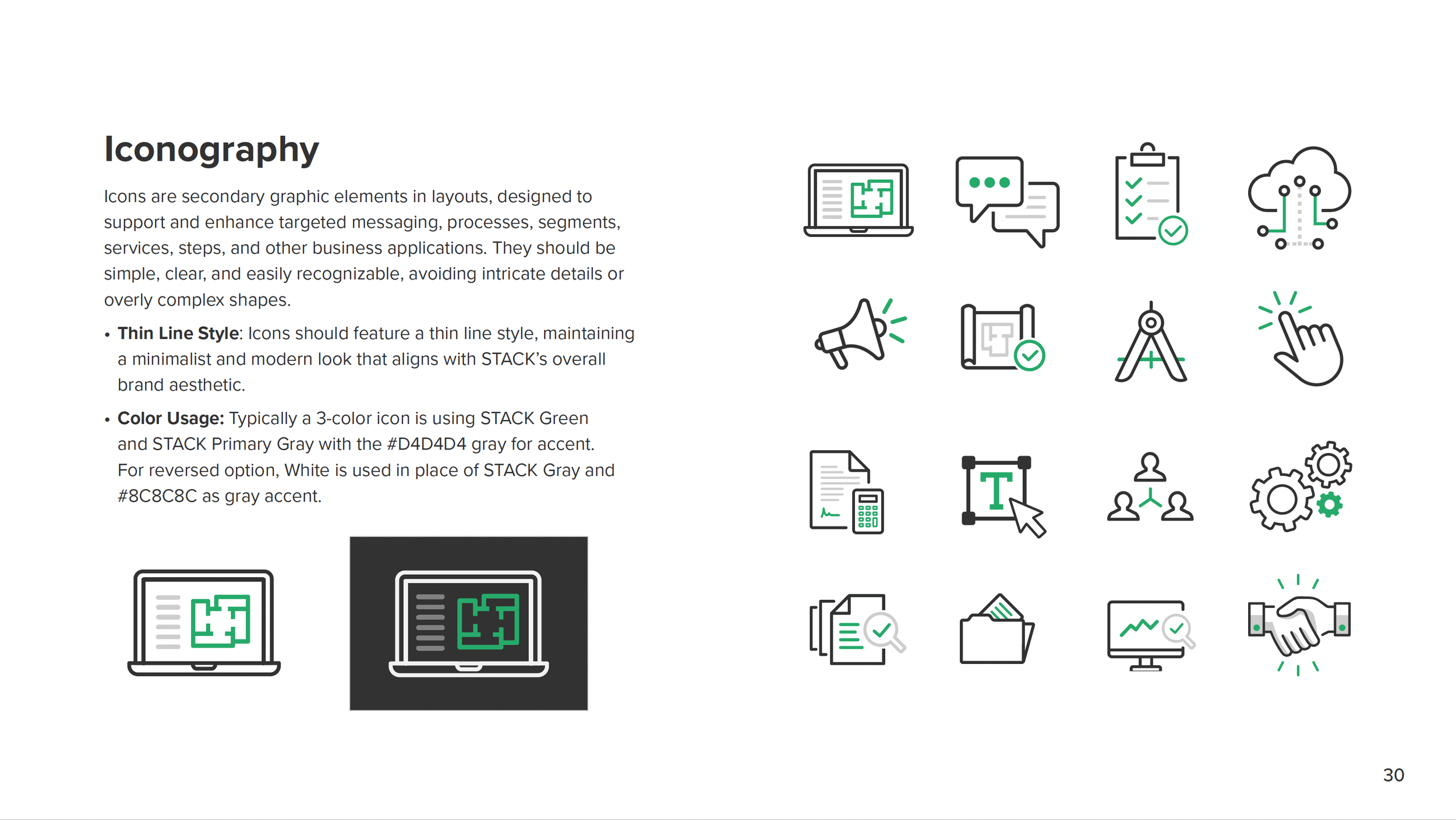
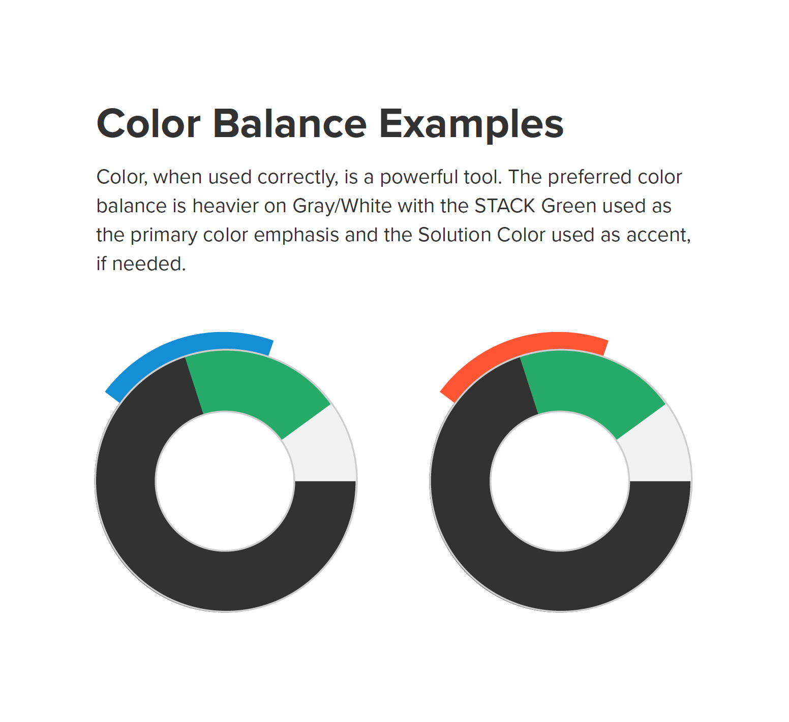
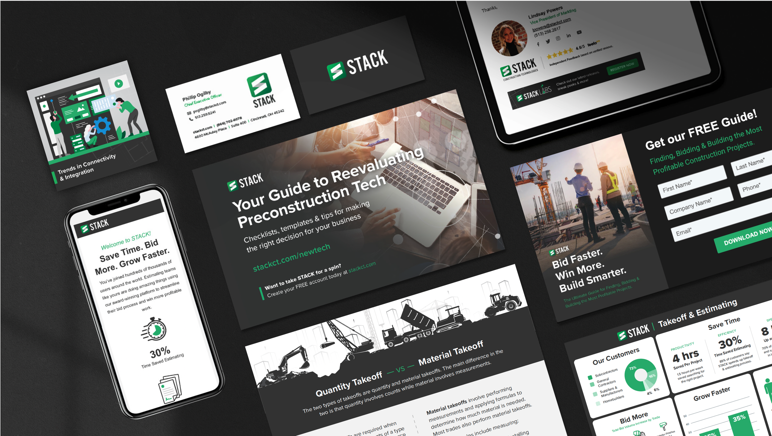
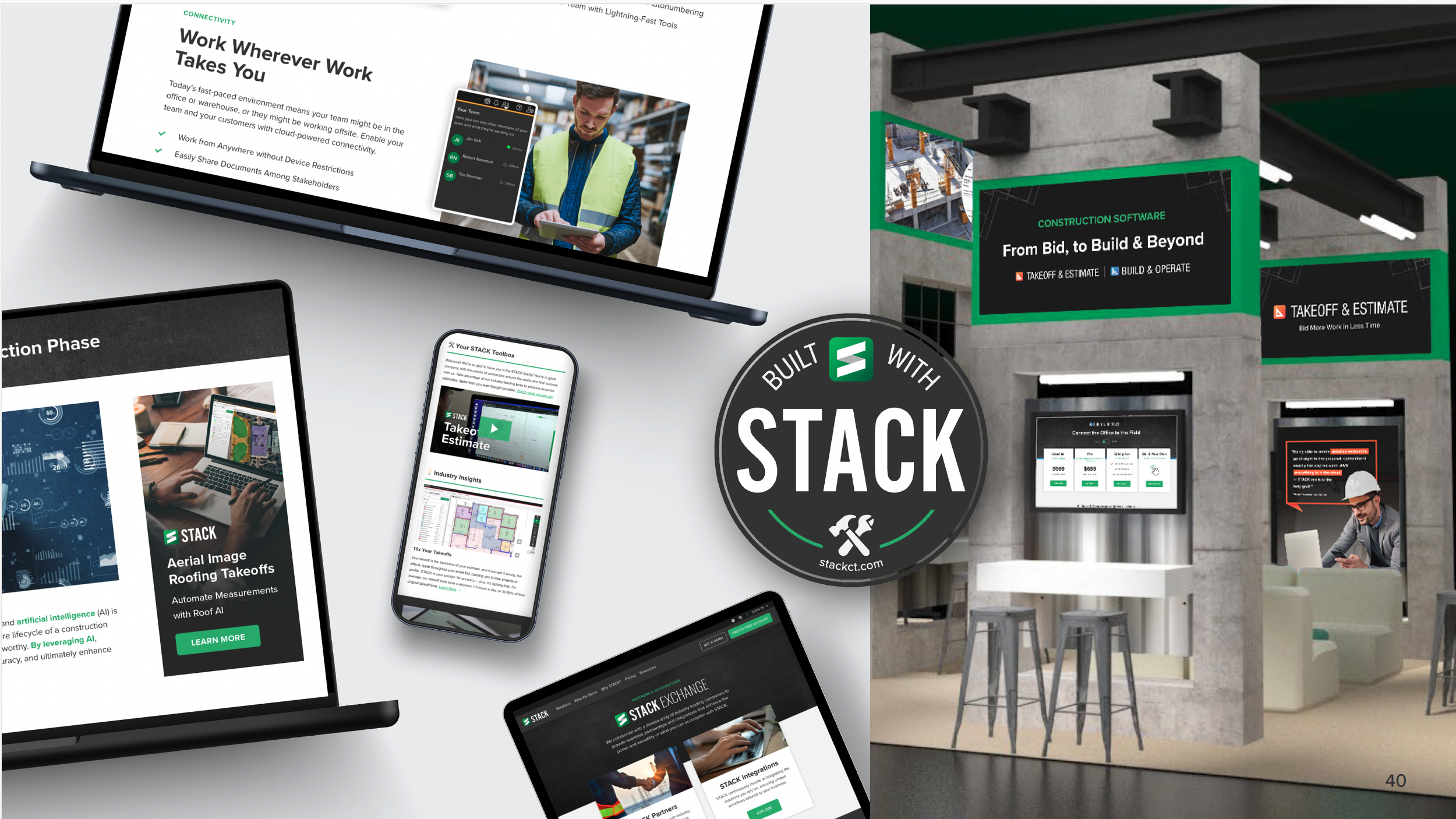
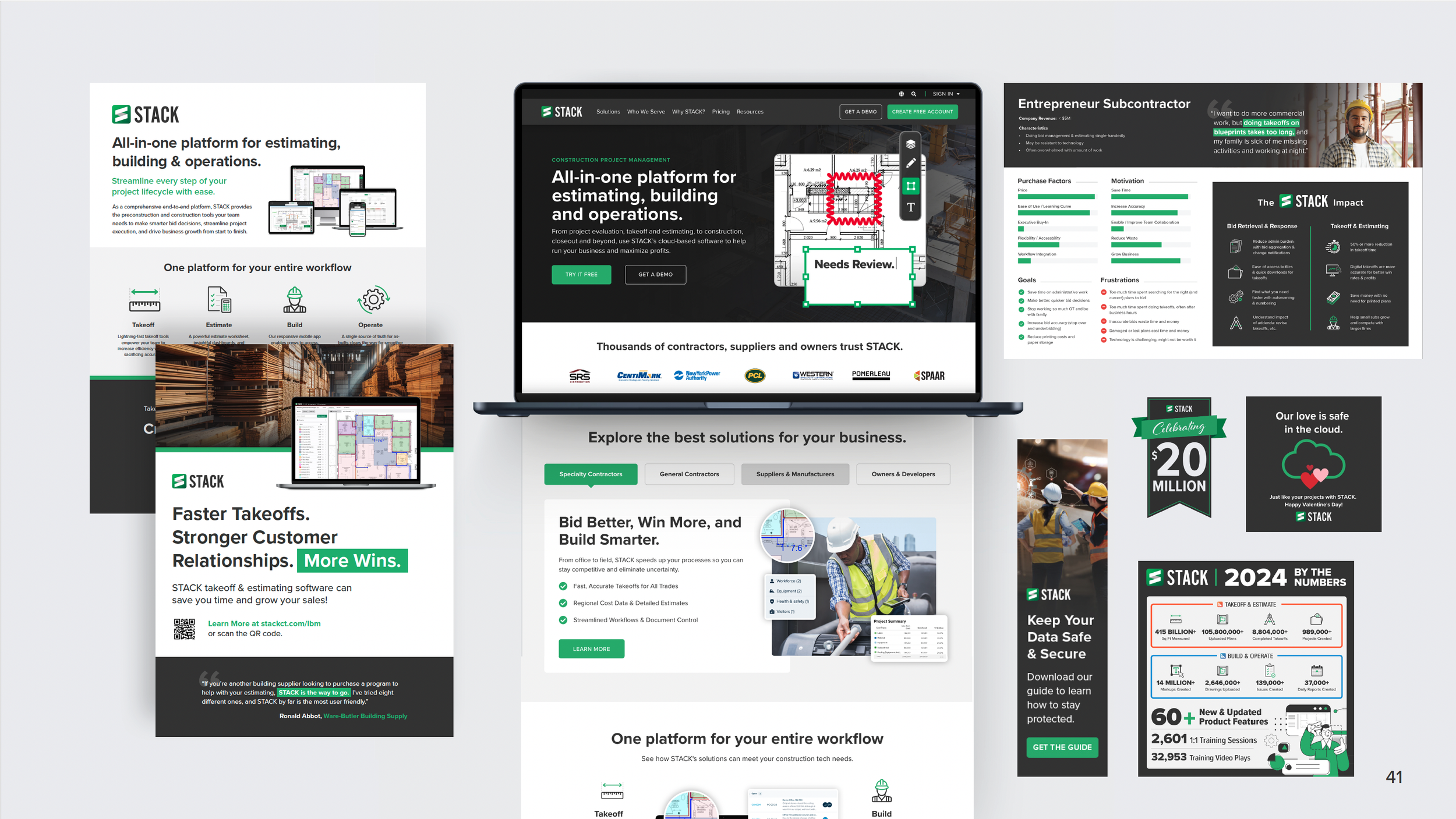
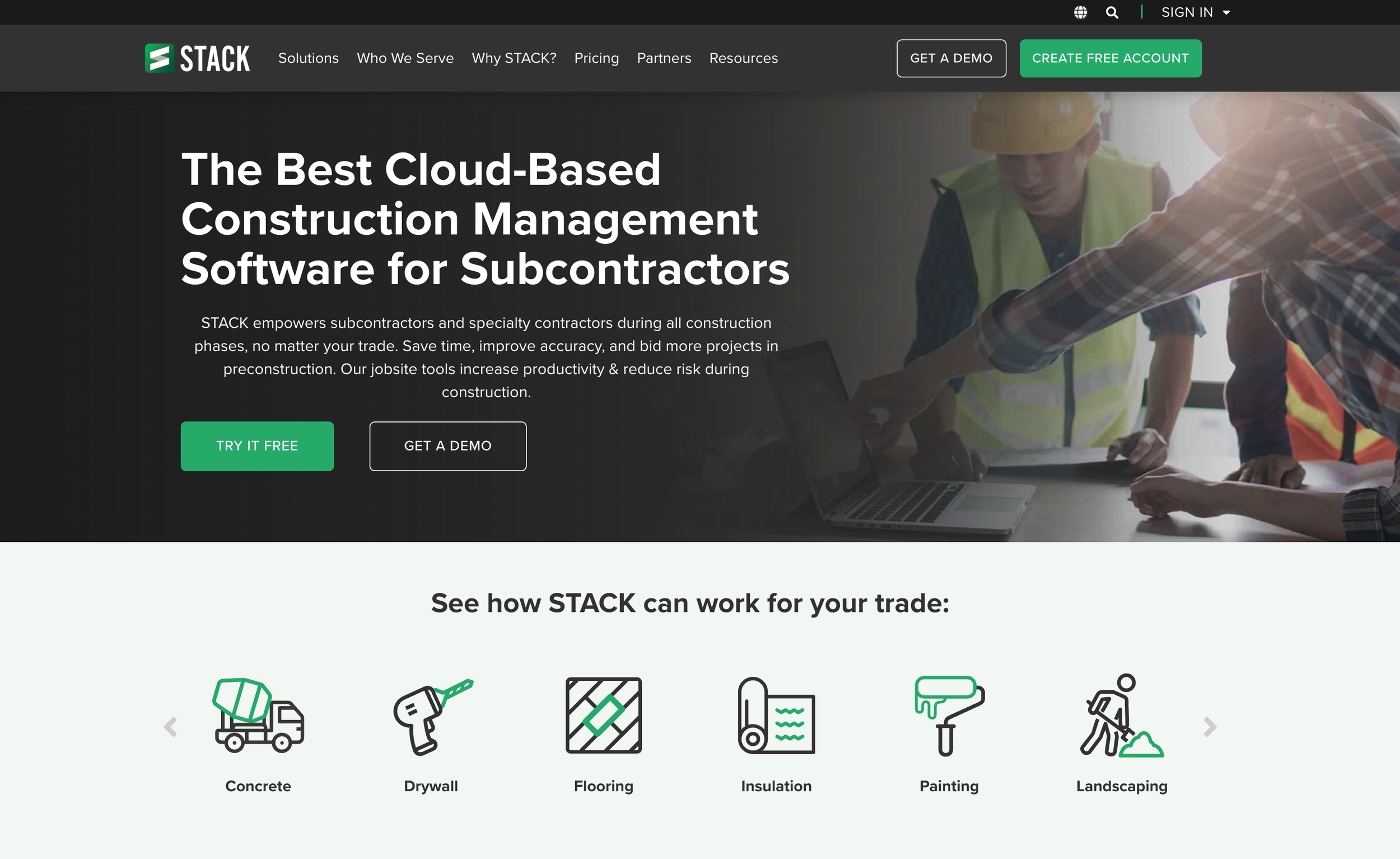
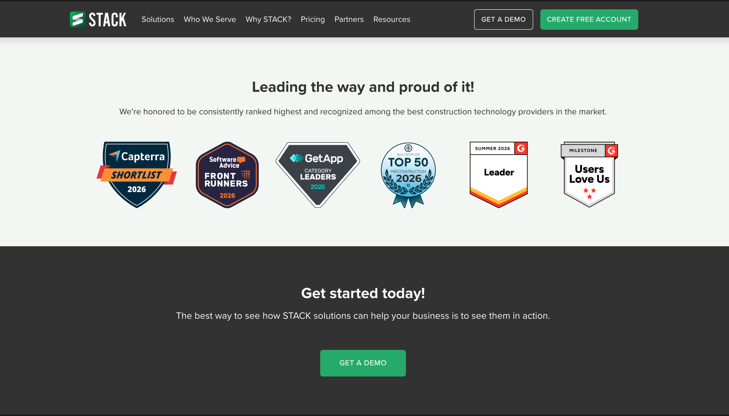
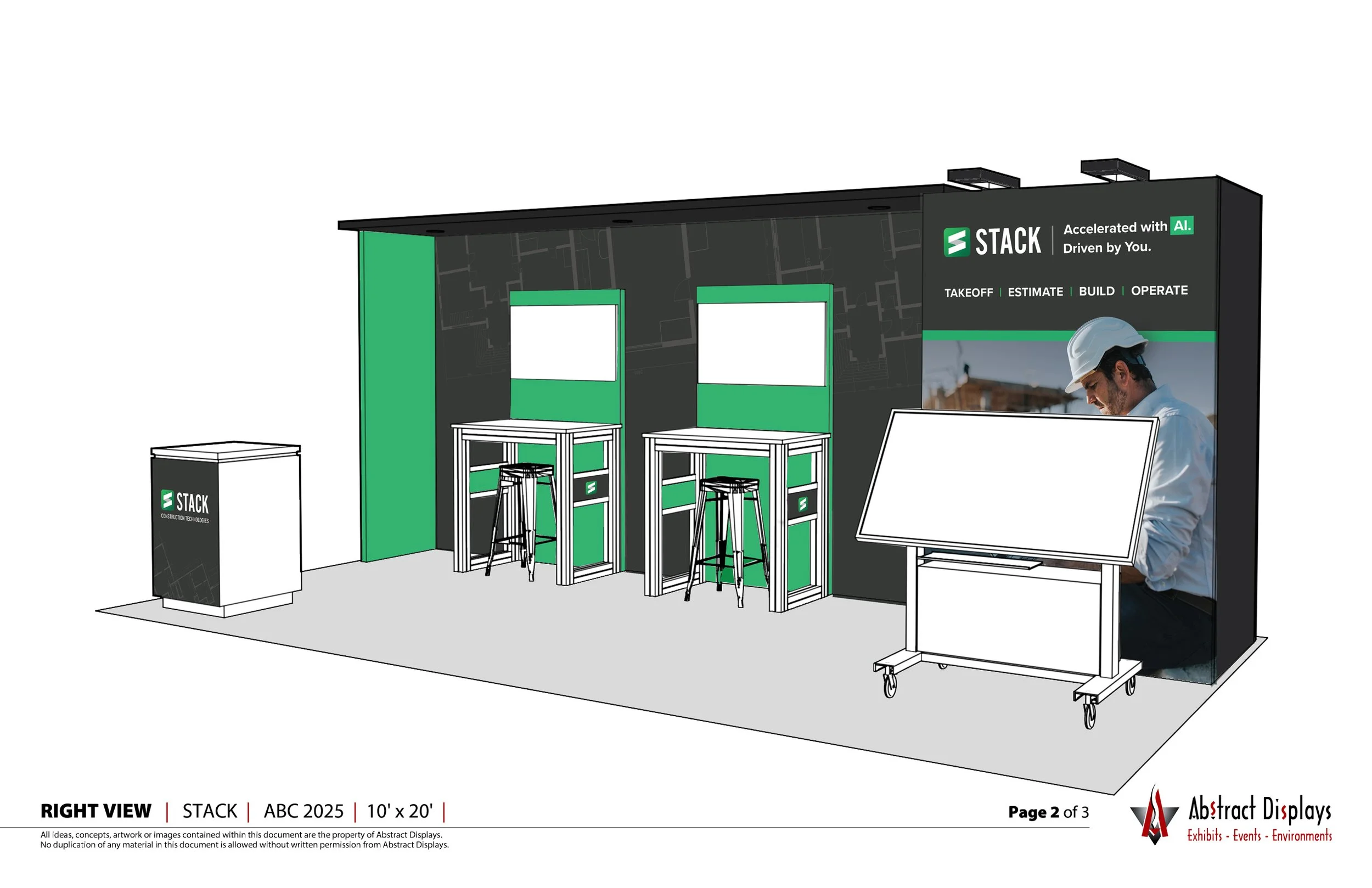
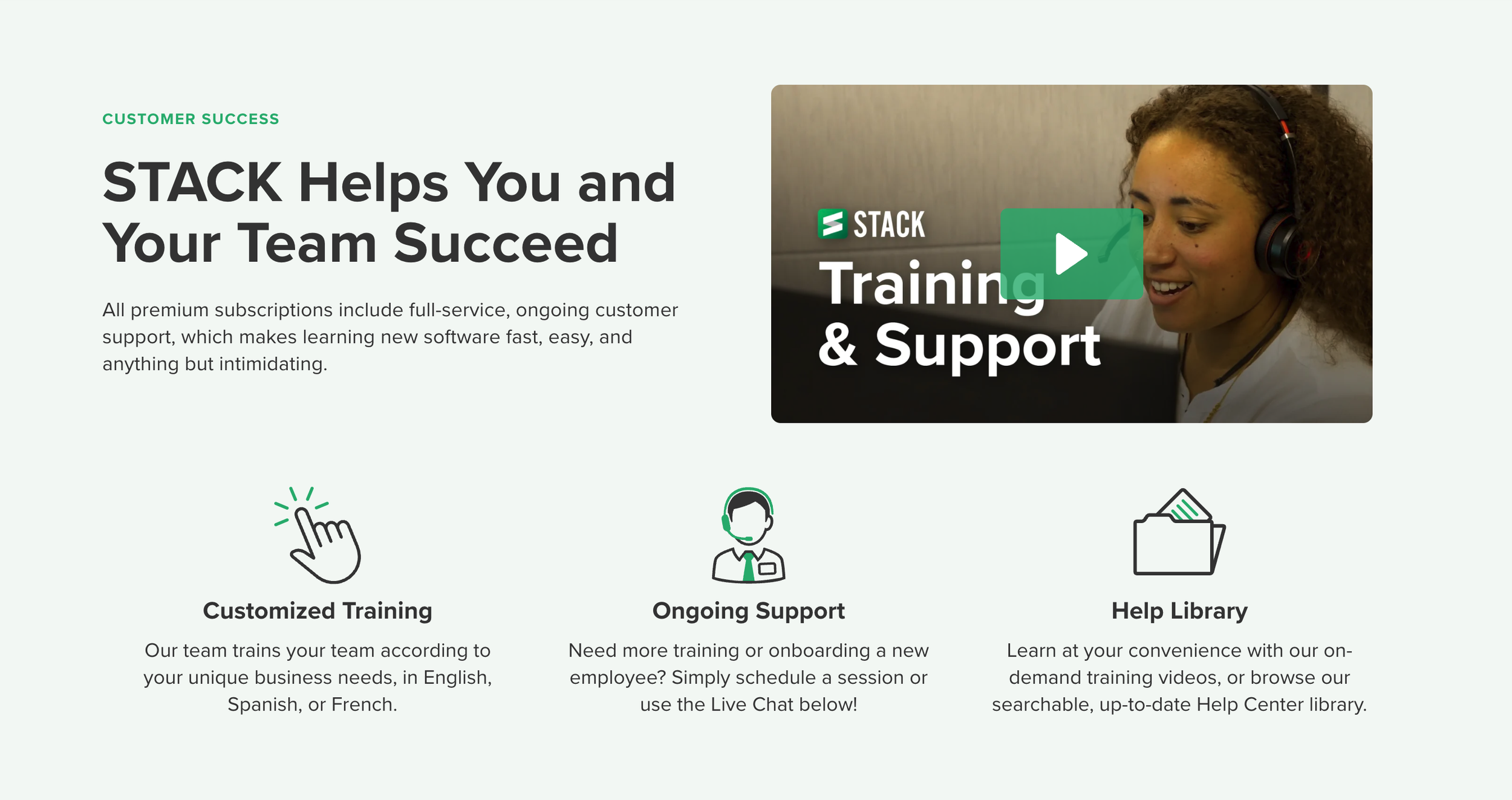
Phase 1: RebrandWhen I joined STACK in 2021, the team was midway through a website rebrand with an outside agency. The previous brand aesthetic was outdated and rudimentary, and the new site would set the direction for a new visual identity. While I learned the product, STACK’s market strategy and its audience segments, I was also guiding the agency’s design work. That grounding shaped my feedback. Next, I led feedback rounds on their concepts, pushing each iteration closer to the right visual strategy. I ran a product brand audit and coordinated a more deliberate bridge to close the gap between marketing and product branding. Once the web identity was set, it became the foundation for brand systems that did not exist yet. I helped the team develop email and social templates, built shared asset libraries in Adobe, SharePoint and HubSpot, and set up a creative request process still in use today.
Next Phase: Powered By STACK
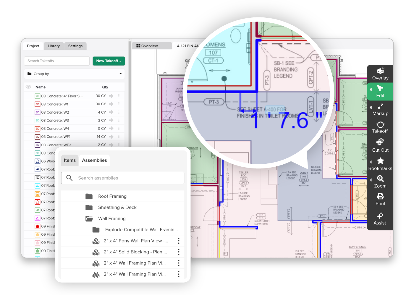
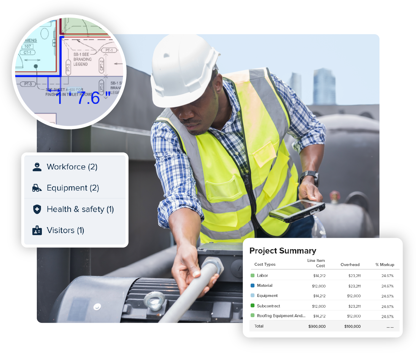
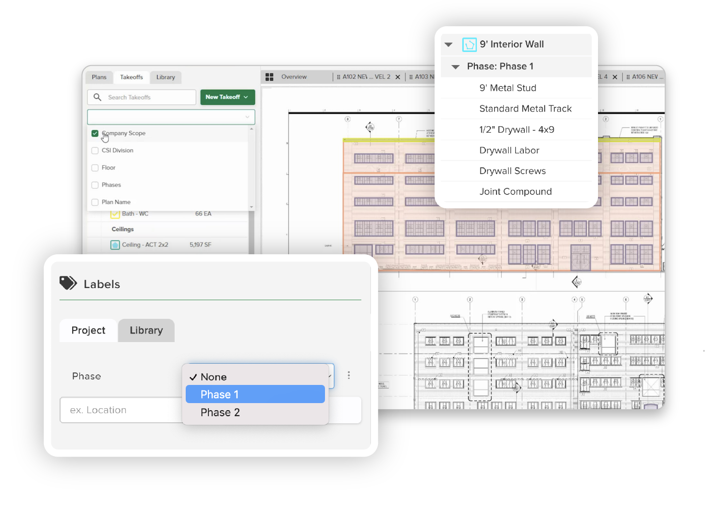
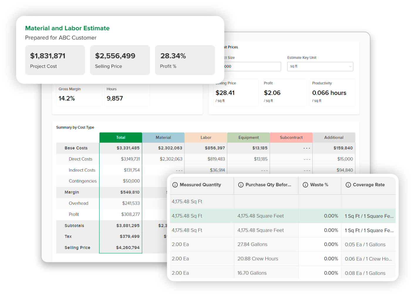
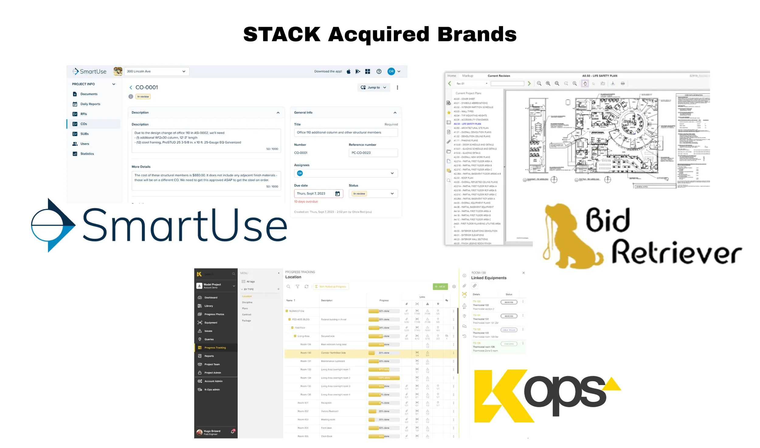
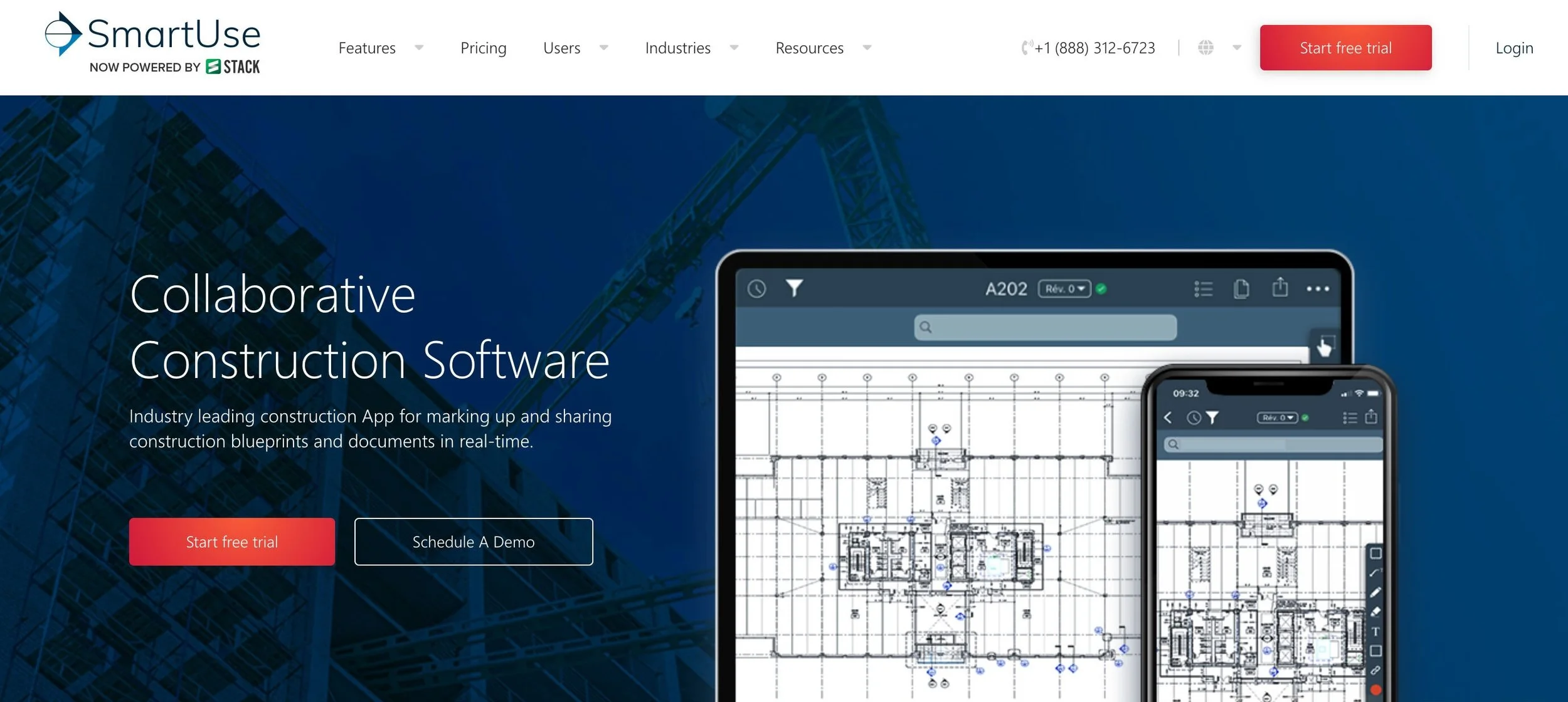
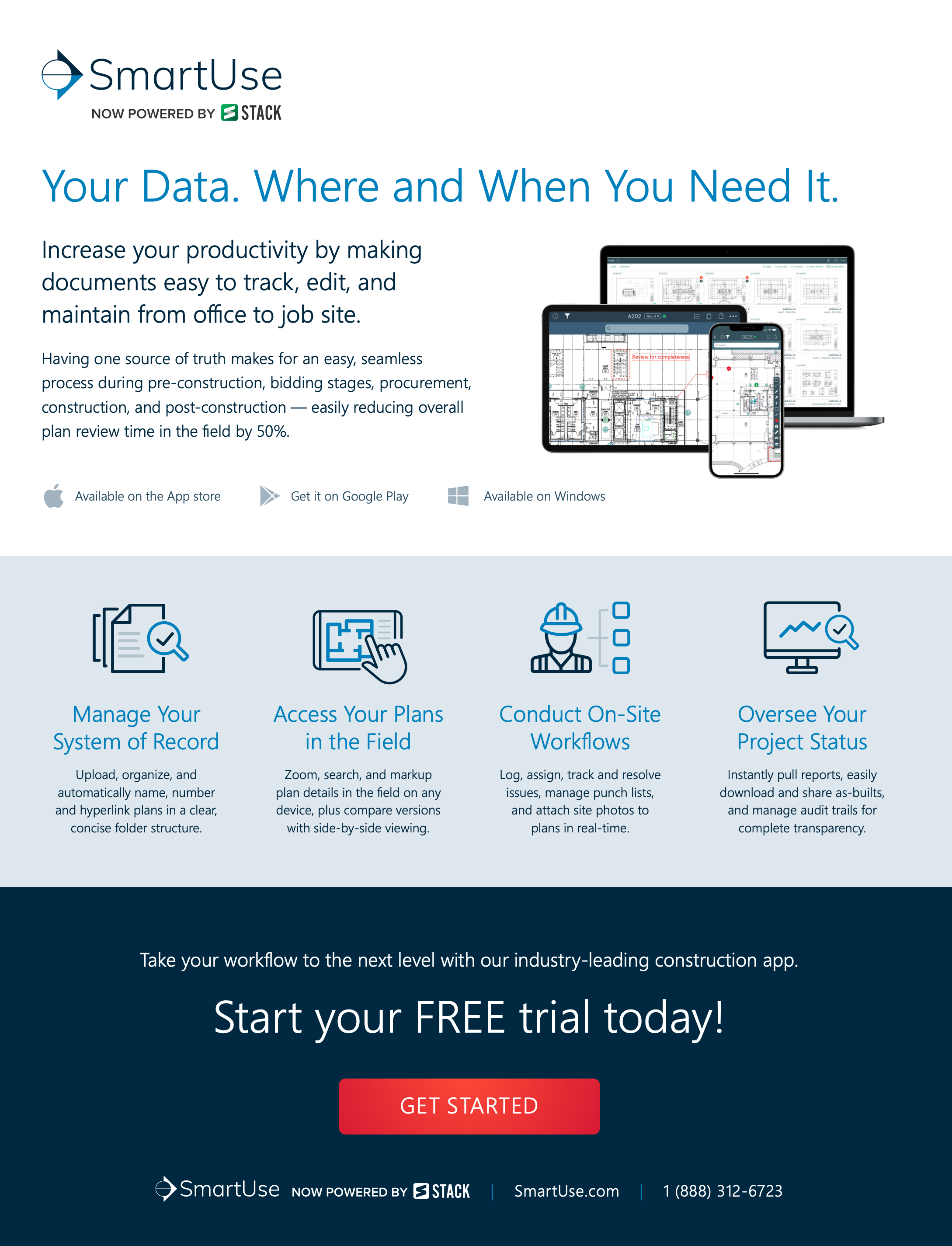
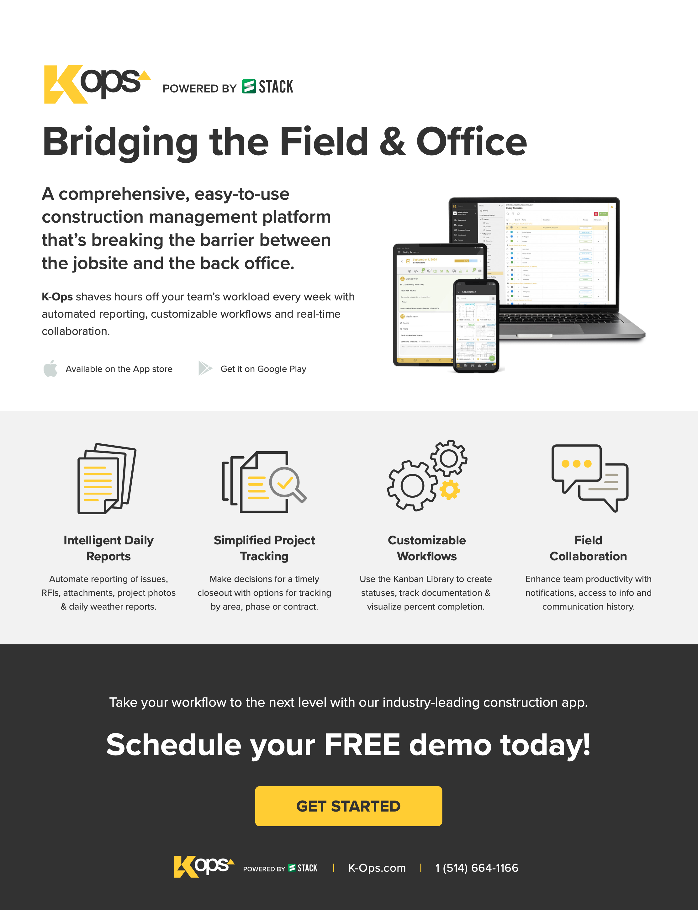
Phase 2: Powered by STACKSoon after the rebrand, STACK acquired three construction software products: SmartUse, K-Ops and Bid Retriever. Each product arrived with its own look, and customers needed to know STACK was now under the hood. To bridge the gap, I created the “Powered by STACK” branding strategy while product teams absorbed the functionality into STACK. K-Ops and Bid Retriever were sunset quickly. SmartUse was a larger, more complex product with stronger brand recognition, so it kept its name longer. My team and I navigated these branding challenges while still promoting each product. SmartUse and K-Ops also had large French-Canadian audiences, which required new translation processes. I worked cross-functionally with content, development and help center teams to build automated and manual translation workflows.
Next Phase: One STACK Platform
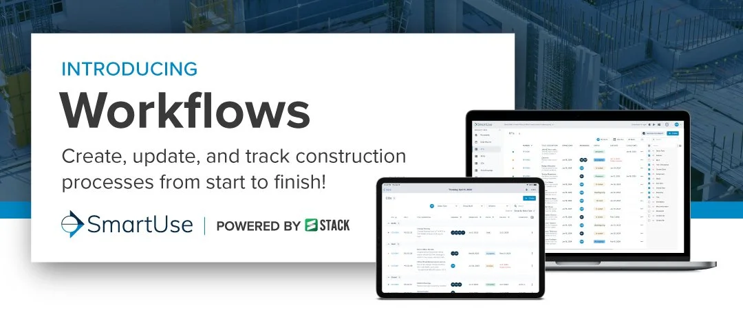
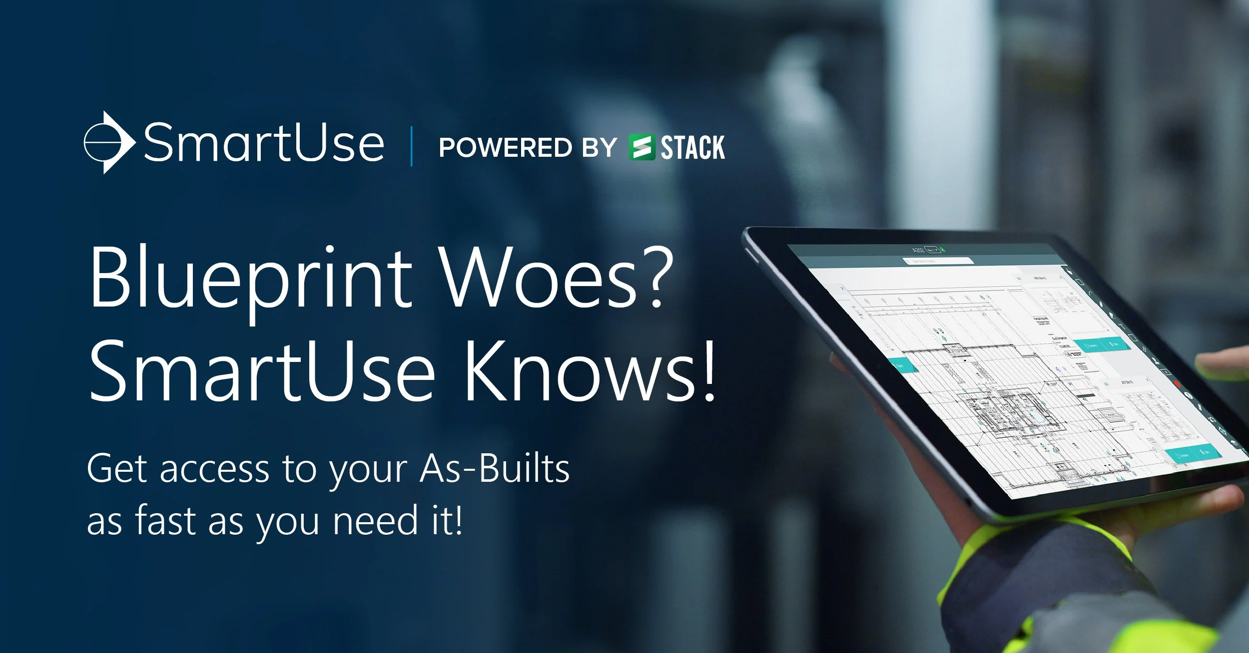

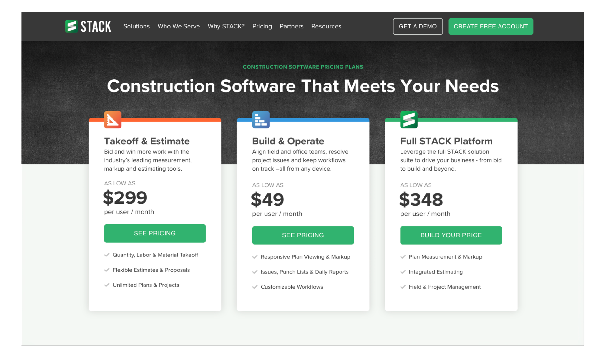
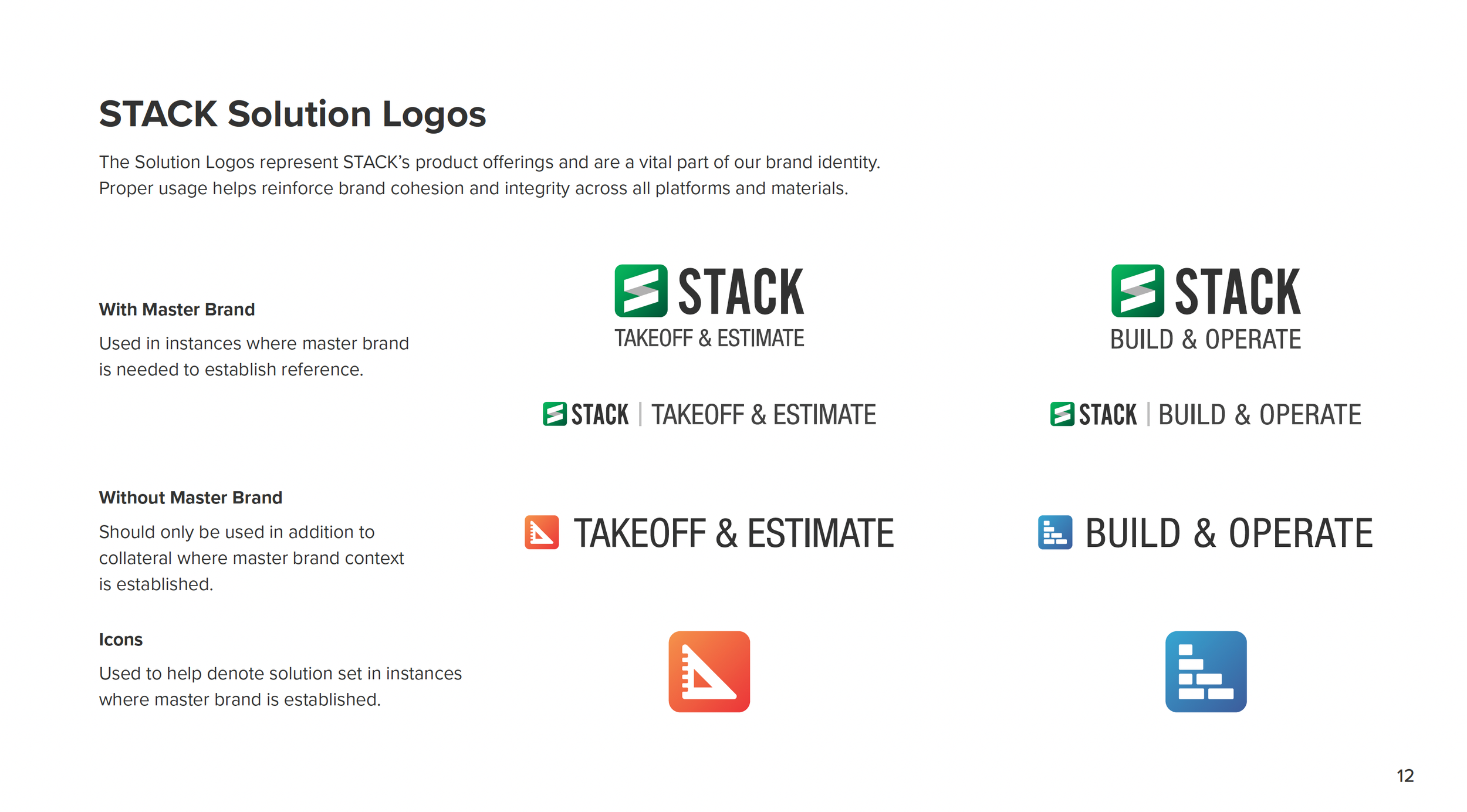
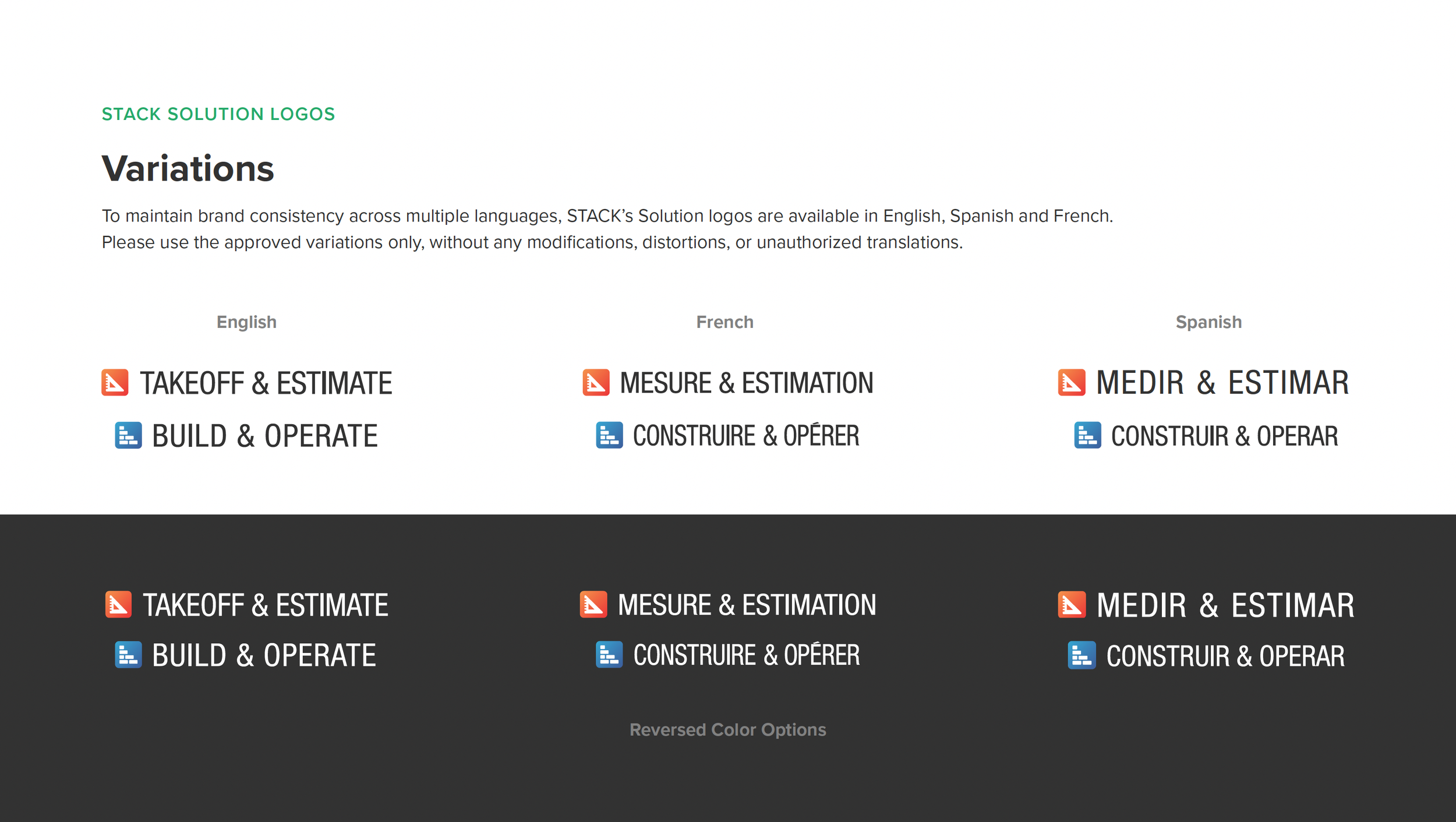
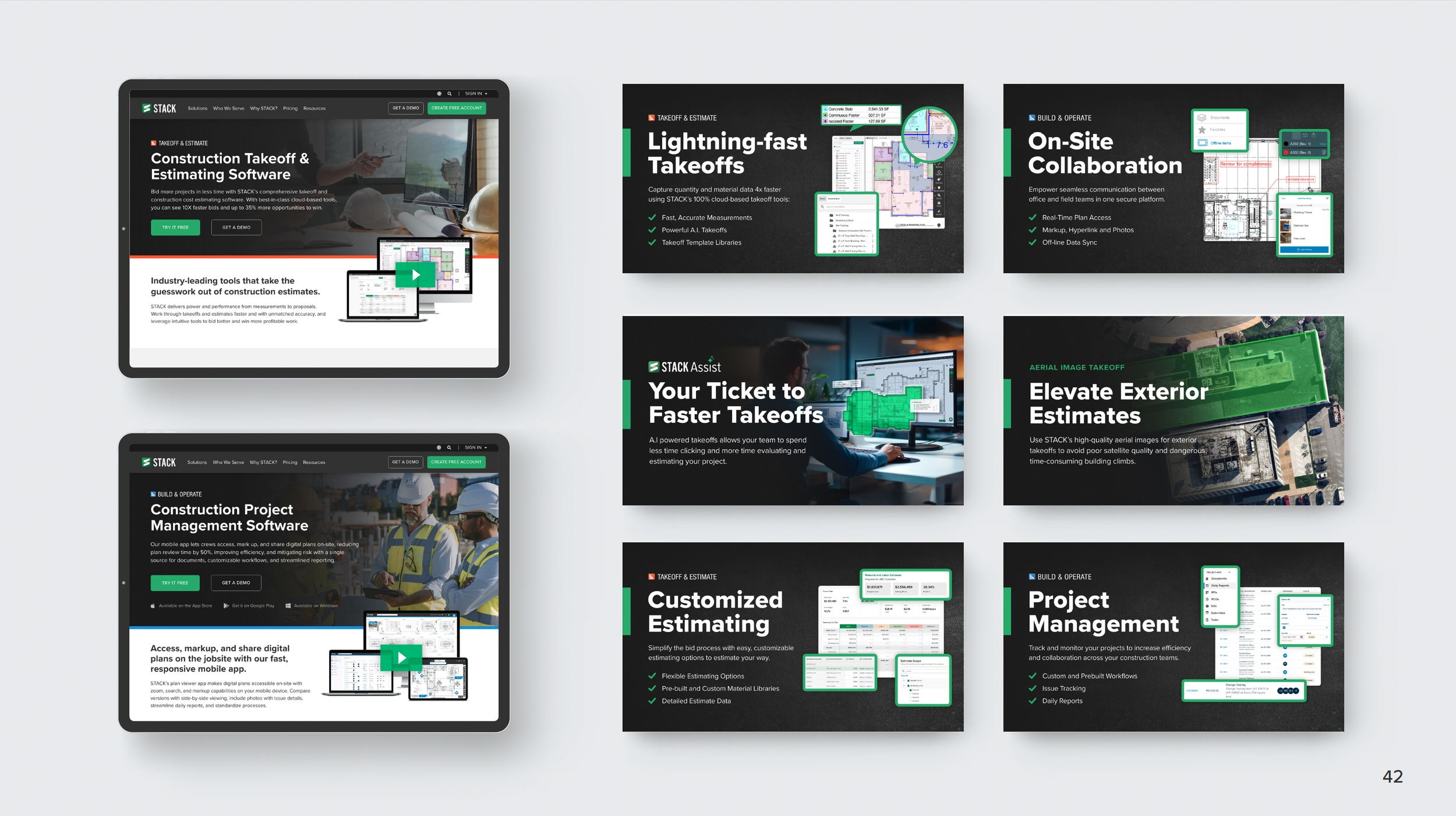
Phase 3: One STACK PlatformWhen it came time to sunset SmartUse, separate subscription platforms made it impossible to fully merge the two products into one user experience. We still wanted STACK to feel like one connected platform, so I built the rebrand plan around one brand with two solutions: Takeoff & Estimate and Build & Operate. Each solution got its own sub-branded logo, accent color, icon and target audience.
Alongside updating marketing communications to the new visual strategy, I helped lead the work to match the SmartUse app branding to STACK, so both apps felt like one platform. While I ran point on the top-level brand needs, I delegated and managed work across the organization. A junior designer handled launch announcements and updated past campaign materials and sales collateral. Our learning content specialist, help center content creator, and product marketing leads updated their materials, so all customer-facing content was aligned.